WHO/WHAT/WHERE/WHEN
Why is this needed?
Human connection is #1 factor in mental and physical health. By assisting people with the social interactions, we fulfill their deep desire for connection and empower their journey to personal health and happiness.
Discovering our Audience
Understanding Our User Through:
A Survey
After speaking with our client, we were able to generate two separate surveys and received 197 responses. Our main takeaways were that users are willing to walk or drive about 10-20 minutes to meet and that they would like to meet new people however, they do not have a ton a free time and are introverted.
-
38% of our user admitted to only have 1-2 hours of free time per day. While this information is good, I'm curious.
-
Are you available more on weekends or weekdays?
-
That 1-2 hours, is it more morning or evening, or night.?
-
What do you do during those open time slots?


-
Our stakeholder wanted us to focus on "LinkedIn" as a requirement for each user to participate. Hoping this will unlock the world of young professionals.
-
Our survey noted an alarming number of people utilize "Discord" as forms of online communication.
-
What kind of people use discord, and what are they saying?
-
Of course we needed a few open-ended question for our participants to answer. Allowing space for a more authentic and genuine response.

User Interviews
-
These interviews definitely seemed to match some of the insights that we received from our surveys, however, we found out during interviews that our prospective users are overall cautious people and would want to meet in public settings and would want info about the people they are meeting beforehand. Furthermore, they would be more comfortable meeting if an activity or event was the reason for meeting and not just meeting to meet.
Who is the Competition?

-
While Bumble BFF and MeetUp would be the most direct competitors to our app, we made sure to keep a close eye on Facebook and Next Door because many people use only Facebook for planning events or find someone to spend the afternoon with and with Next Door the product is neighborhood-based and focused on the community as a whole although not individual connection focused.

-
Our client was a big fan of Costar so we wanted to look into what works with this app. Costar is definitely a tool to make real life connections which is something we also were wanting and you barely spend time in the app instead, using it as a topic of conversation as it does allow you to compare your Astrological charts with others.

-
We also looked into Instagram mainly because it’s such a popular app. Our main takeaways were that the UI is relatively simple which is something we would want for our app however it’s definitely not about real-world connections, the focus is more on feed and marketplace.


Audience Defined (for now)
Who Are We Designing For?
-
The team and I synthesized the 15 user interviews into a fairly large affinity map, categorized by “I statements” using Miro.com as this work was remote.

Who Are We Designing For?
-
We spent a lot of time with this persona as we knew that it would be the key factor in our ‘define’ stage of the double diamond and because of this wanted to make her as “real” person as we could. We also made sure to include the demographics as well as inclusivity that our client wanted to keep in mind


The more research the better.!
Empathy Mapping
-
Created based on information obtained from users
-
Not a ton of free time, only available nights and weekends
-
Explorer- if she’s not busy she still wants something to do and enjoys exploring her neighborhood
-
People Person who feels she can be a bit awkward, she enjoys meeting new people but needs something to talk to them about
-

Journey Mapping
-
With Journey mapping we wanted to keep in mind that this app is a tool for meeting new friends and the most satisfying experience should be off the app. This helped us to understand that while the UI should be appealing and the Information Architecture should be consistent, the app itself should not be the main draw but instead the other users you can find there.

Design Phase
User Flows
Transitioning from the first diamond into the Design stage, I created user flows to outline the process in which a user would utilize for the many solutions annotated through research.
Flow#1 : Find and event based on filtered options, see who is going, and chat with them.
Flow#2 : Local community events, and local Covid-19 statistics.
 |  |  |
|---|
Design Studio & Wireframing
-
With our design studio, we all created our own sketches but Shandreanna’s were an overall favorite. We did, however, include the maps from Chelsea’s sketches, the profile questionnaire screen’s from Ashley’s and the event and hobby category screens from Julius’ sketches.


Taking the ideas we converged on, we began developing lo-fidelity wireframes: View more.


Julius was our main designer for this project although we all took a part in the design process; Shandreanna focused on animations as well as naming categories and giving our mock users personalities including their profiles, hobbies and messages.
Chelsea focused on the news screen, the map expanded screen and the map match notification screen, while Ashley collected the pictures, fixed alignment, found real world examples of events to include and worked on details of screens with many components such as the explore screen.
Julius was responsible for the design overall and while working on his own screens, such as the profile questionnaire screens and explore page screen, reviewed the work the others did to make sure that each screen was consistent and followed the decided upon design.
Usability Testing
-
We conducted both moderated Usability tests and unmoderated tests. The key takeaways from both were that our users overall enjoyed the app, however, they felt uncomfortable using linked in to log in, either because they were unfamiliar with it or they did not like the idea that their professional and personal lives could intersect.
-
There was also some confusion with the map, as it was relatively small and we did not include a “you are here” icon to make it clear that it was interactive
-
The toggle to turn on location services was also not originally labeled so users were not sure what it was for.
-
We originally started the profile building section of the app with short answer questions and most of our testers preferred to do multiple choice first.
Iterations

-
The home page presented many issues with the map and understanding its purpose. Many user did not understand the map was interactive. There was also an issue with users local visibility. Could they be tracked? Is that an element I can control?
-
To fix the issue we zoomed into the map, providing a more local view, the "You are here" star is a universal symbol more widely recognized. We keep the icon yellow to acquire the attention of the user.
-
You'll also notice a toggle switch for location visibility.


-
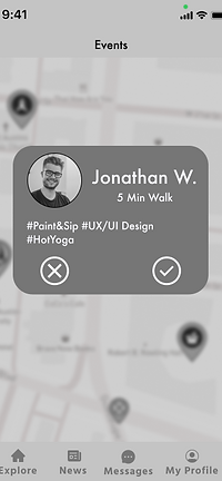
The original design on the left was for Spontaneous match-making between users. This feature would not give Jonathan feedback.
-
Intent was to give someone that extra push to engage with others users in the area. Also the spacing was far too crowded and difficult to read and comprehend quickly.
-
We corrected this issue by displaying a check-mark and an "x".


-
The idea was ultimately scraped.
-
Why push for ultimatums, does the user have to decide now? Yes & No seems so decisive, and it is a hard line in the sand.
-
Remember we are SpontaneYes does this align with our ultimate vision…...NO!!!
-
We wanted to limit the amount of NO, because we are focused on encouraging and empowering people to harness word YEEESSSS!

Delivery Day
Mid-Fidelity Usability Testing
Once iterations on the low-fidelity wireframes were complete, my team and I created our mid-fidelity wireframes and ran a second round of tests with serveral different users. Overall, the results were great! Our users navigated the process efficiently and with minimal issues. The metrics I created for the second round of tests were all achieved for both the number of clicks and the time it took to achieve a task.
![iPhone 12 Pro [Back].png](https://static.wixstatic.com/media/1779a7_ec352380b9124d938aaae7ba22693db8~mv2.png/v1/fill/w_199,h_543,al_c,q_85,usm_0.66_1.00_0.01,enc_avif,quality_auto/iPhone%2012%20Pro%20%5BBack%5D.png)

Want to see more?
Next Steps:
-
At this point our statement of work was done but we did want to leave a reference of next steps for our client as he continued the process of creating the app. These next steps include:
-
Broadening Demographics to include more ages and when doing this working on personas based on these new user interviews and surveys
-
Focusing on color psychology as we did look into this ourselves although our client was not ready to move on to a high fidelity prototype
-
Looking into Research synthesis software such as Dovetail for ease of access to prior research
-
Look into seeing more options for groups as the emphasis is on individuals meeting at the moment
-


